Search Blog
Recent Posts
-
 7 Best E-commerce Platforms...
This interesting yet informational blog post highlights and compares the best e-commerce platforms in 2025.
May 6, 2025 Read more
7 Best E-commerce Platforms...
This interesting yet informational blog post highlights and compares the best e-commerce platforms in 2025.
May 6, 2025 Read more -
 How to Boost Your...
This blog post highlights how smart shipping strategies from Prestashop store owners can enhance their e-commerce...
May 2, 2025 Read more
How to Boost Your...
This blog post highlights how smart shipping strategies from Prestashop store owners can enhance their e-commerce...
May 2, 2025 Read more -
 7 Highly Effective Ways to...
This interesting blog post highlights 7 effective ways of boosting PrestaShop sales in 2025 from the PrestaShop...
Apr 30, 2025 Read more
7 Highly Effective Ways to...
This interesting blog post highlights 7 effective ways of boosting PrestaShop sales in 2025 from the PrestaShop...
Apr 30, 2025 Read more -
 The Power of A Customer’s...
This exciting blog post highlights how important customer feedback is for e-commerce businesses these days.
Apr 22, 2025 Read more
The Power of A Customer’s...
This exciting blog post highlights how important customer feedback is for e-commerce businesses these days.
Apr 22, 2025 Read more -
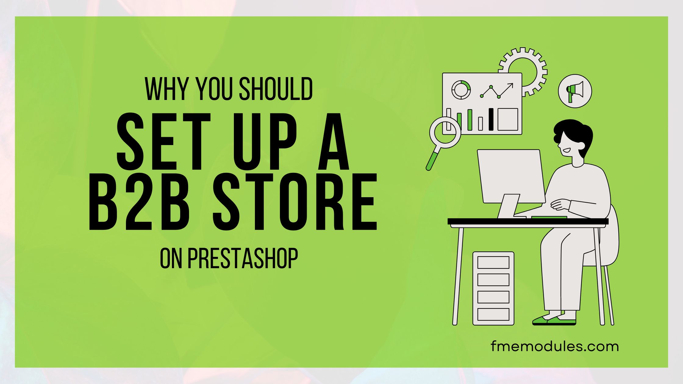 Why You Should Set Up a B2B...
This blog post highlights why you should consider Prestashop for a B2B business.
Apr 18, 2025 Read more
Why You Should Set Up a B2B...
This blog post highlights why you should consider Prestashop for a B2B business.
Apr 18, 2025 Read more

How to Design the Best E-Commerce Website Experience
Posted On: Sep 4, 2018
Categories: web design
Design Best E-commerce Website
Create the best e-commerce site using a user-focused strategy. It must blend usability, design, and functionality. Great experiences build trust, help consumers find what they need, and inspire conversions.
But then again, there are always those few customers at the end of each day who didn’t have what you call “a satisfactory experience”. And after that, there isn’t really anything left to do but act on instant damage control, judging by the fact that those nerve-wracking experiences end up costing ecommerce businesses to face a serious loss in sales.
User-Friendly Navigation
Simple navigation is essential for customer-friendly product finding. Organize your menu using a hierarchical, well-defined set of categories and subcategories. Add an autocomplete search box for quicker product finding. Larger catalogues allow filters and sorting (by price, popularity, or ratings), which lets consumers narrow their choices quickly.
Are People Judging You By Your Cover?
So they say, never judge a book by its cover. But for some odd reason, when it comes to websites, every site is judged based on its design. It is necessary for one to determine whether your site appears to be trustworthy enough or not? And does the content seem easy to understand or is too dry for a few people to stay around for long enough?
More than any other kind of website, it is essential for e-commerce websites to deal with this as people have to feel adding in personal information is safe.
You can get started by either looking harder than you have been so far or asking someone to take a look, as they might show you a side you never noticed before. To get the best results, you can also hire a company like Fmeextensions known for its best ecommerce website development Dubai.
For instance:
- What does my site reflect in the first few seconds once someone visits it?
- Is the content provided relevant enough to keep visitors hooked in deep enough?
- If a visitor stumbles upon my site and knows what they want, will they manage to find it without any inconvenience?
- What if I had to put my credit card details on this site? Would I feel comfortable enough to?
- If my website is fully optimized for search engines if not use modules like Pretty URL or SEO Optimizer.
The problem doesn’t lie within the questions but more like in the answers of them. If you or your friend had a negative response regarding any one of the questions above then, it is a problem then. Since it comes down to define why your customers have been running away all this time!
Make It Obvious; What It Is You’re Selling
When you visit your site, you need to see if you are able to take a wild guess at what it is you sell or have you made it obvious enough for anyone to understand it loud and clear?
Once a customer has decided what it is they are looking for, they’ll hit a search up to find all the places that meet their need. Accordingly, they will choose those sites that appear might have what they’re searching for. Regardless of the fact that they may have found over a million of places that have the product, they still ended up on your site. You need to make sure your site has what it takes to retain a customer.
You have three seconds to tie them down to your site as the best option so that they know your website is best choice.
In order to achieve that, make sure your font size is easy to read. Keep subtle yet vibrant colors at the same time; they should be in sync with your theme. According to the color of the text you choose make sure it goes well with the background.
Comfort Is All You Really Need
As soon as you succeed in making sure a customer is bound to stay after 3 seconds, half of the work is already done. But now comes the second most important task on your list: securing your website enough to reassure your customers that their personal information will be in safe hands.
When they say your first impression is the last, they definitely mean it in the way that you think when it comes to your website. This means no one would put their trust in a dull site it looks old-school to death and it seems too time-consuming to fill out the form that. They’d prefer to find something a lot more convenient than just running away.
How can you avoid this but also obtain vital information to process their request? First, design a form that is simple and easy to fill out, keeping it as short as possible.
Secondly, remember that there are multiple ways to establish a fool-proof checkout process. As everything has its own set of pros and cons, there are definitely some major benefits in creating a multi-step checkout process. For example, sometimes a customer tends to add in a few items to their cart, but then abandons the cart and takes a run for it. The pro here, is that you at least managed to score their email address which will allow you to lure in your customer as you also can guess their taste regarding the products on your site.
On the other hand, if you’re trying to solve a transaction issue, you should stick to the single-page checkout methodology to build the trust you need between you and your customers.
Although the form section is essential to establish a trustworthy bond between you and your customer, you also need to consider a major boost edit to the appearance of your web design. For that, you need to focus on the use of imagery of all kinds, high in quality but low in resolution, so that they don’t take forever to load and keep your customers from losing their minds.
Keep Putting Each Element To A Test
After you cross out the top two major tasks off your list you must feel like you already own everything, right? I’d hate to break it to you, but that was only the beginning. Just because you have covered the essential parts that doesn’t mean continuing to check for flaws through several tests would hurt.
You must be thinking what is left to test right now, right? Here are a few things just to get you started:
- Try a test which features all your top-selling products on your homepage.
- Test the response to a sign-up button regarding special offers on your homepage.
- Try to add a new product category, while testing the order of your product categories while navigating through the site.
- Test the efficiency of the font, size, color etc. of the “Add to cart” or “Buy now” button.
Try To Make The Offer They Cannot Refuse
It is important to lure a customer in with what products you have, but it is far more necessary to keep them engaged with an idea or offer that probably no other site is offering and could be more beneficial. For example, let’s say your customer is in search of nice shirts to wear casually. Now, you lured them in with the title and all, but how do you make them stay? Add in an offer like “Buy 1 get 1 free”, or “Buy 1 shirt and get (any other relevant product) free. You can add these offers in the form of text labels and stickers to your product images, as this will save time for your viewers. Not only that, you could add discounts for holiday shopping, or you could do some research and add a buy one, get one free offer by blending a basic necessity with one of the latest trending products!