Search Blog
Recent Posts
-
 How to Fix a Leaky Checkout...
Discover a 5-step plan to fix a leaky PrestaShop checkout funnel. Reduce cart abandonment, optimise conversion, and...
Jul 22, 2026 Read more
How to Fix a Leaky Checkout...
Discover a 5-step plan to fix a leaky PrestaShop checkout funnel. Reduce cart abandonment, optimise conversion, and...
Jul 22, 2026 Read more -
 How to Use Tiered Pricing...
How to Use Tiered Pricing Structures to Double Order Value in: what PrestaShop tiered pricing is, why it matters, and...
Jul 22, 2026 Read more
How to Use Tiered Pricing...
How to Use Tiered Pricing Structures to Double Order Value in: what PrestaShop tiered pricing is, why it matters, and...
Jul 22, 2026 Read more -
 The Missing Link in...
The Missing Link in E-Commerce SEO: Why Generic Image Alt Text is: what PrestaShop SEO is, why it matters, and...
Jul 21, 2026 Read more
The Missing Link in...
The Missing Link in E-Commerce SEO: Why Generic Image Alt Text is: what PrestaShop SEO is, why it matters, and...
Jul 21, 2026 Read more -
 The Ultimate Guide to...
The Ultimate Guide to Custom Registration Forms for Wholesale Clients: what PrestaShop custom registration forms is,...
Jul 21, 2026 Read more
The Ultimate Guide to...
The Ultimate Guide to Custom Registration Forms for Wholesale Clients: what PrestaShop custom registration forms is,...
Jul 21, 2026 Read more -
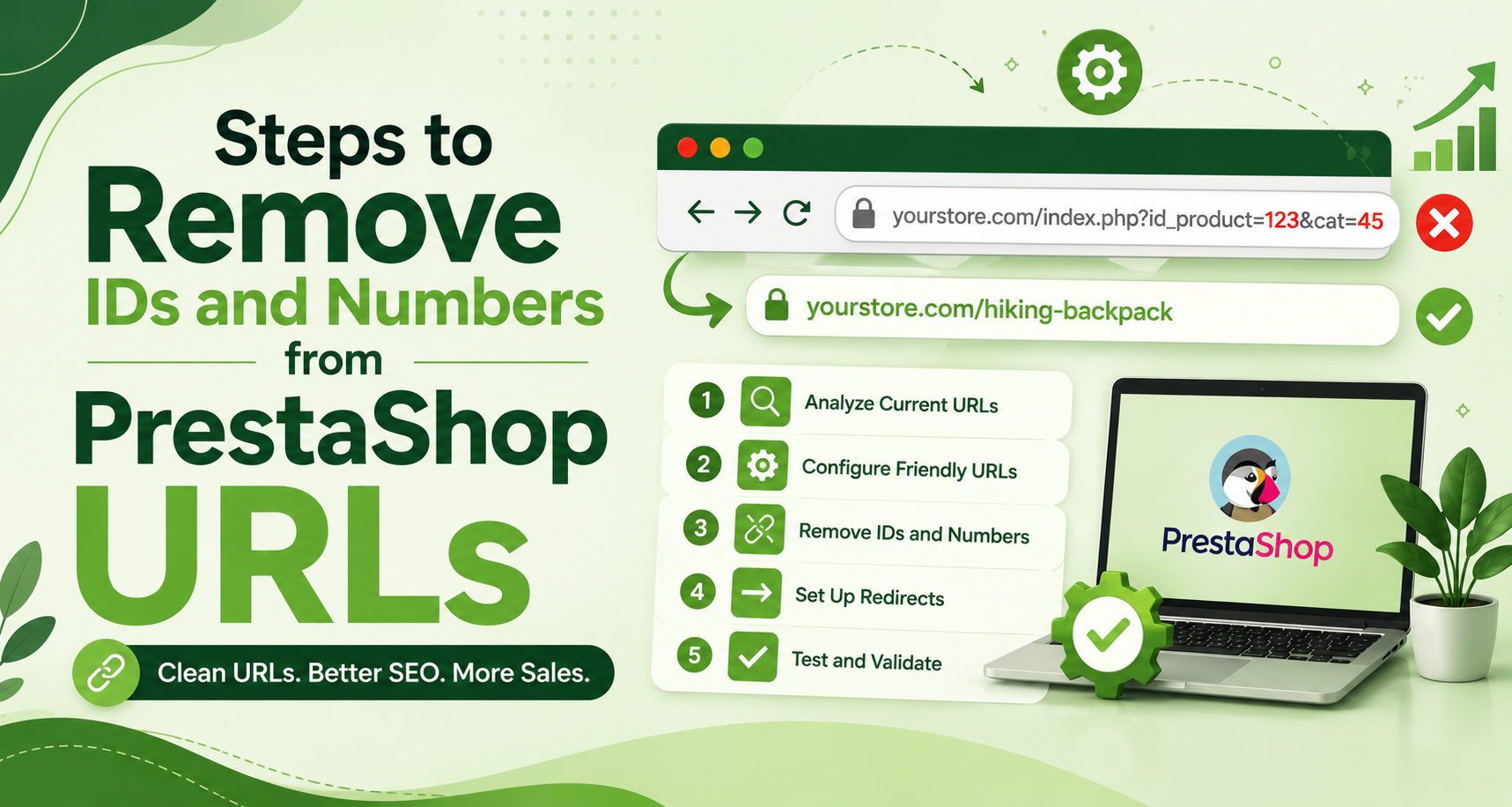 How to Remove IDs and...
Learn how to remove IDs from PrestaShop URLs safely, improve SEO, prevent 404 errors, preserve rankings with 301...
Jul 20, 2026 Read more
How to Remove IDs and...
Learn how to remove IDs from PrestaShop URLs safely, improve SEO, prevent 404 errors, preserve rankings with 301...
Jul 20, 2026 Read more

Is your PrestaShop ready for the mobile search? Here's a 8-Point Checklist
.jpg)
Posted On: Jul 11, 2025
Categories: Marketing , PrestaShop SEO Best Practices: Guides, Checklists & Tips
Author: Zarak
More than 70% of e-commerce traffic is now from mobile devices, but many PrestaShop stores use desktop-focused themes that look pretty vague on small screens.
If you’re not quite sure if your PrestaShop store is truly mobile-friendly, this eight-point checklist will help you evaluate your current mobile performance and improve it. We’ll also discuss how leveraging tools such as the PrestasMobApp or a custom-built PrestaShop mobile app can substantially increase the performance of your shop.
Checklist to Ensure Mobile Friendliness of Your E-commerce Store
Here’s a quick overview of the things you should look into to ascertain the mobile friendliness of your store.
-
Mobile-Responsive Design
Your shop should look good on all devices, no matter if you are using a tiny smartphone or a huge tablet. Choose a mobile-optimized PrestaShop with All Blocks and fonts, and ensure that the menus are customized as listed.
Hint: Check the mobile-friendliness of your website using tools like Google’s Mobile-Friendly Test or resize your browser window to see how your site is displayed on different devices.
-
Fast Mobile Loading Speed
The mobile user is very unforgiving of slow pages. The loading time of over 3 seconds usually results in closing.
Action Steps:
- Compress your images using software like TinyPNG.
- Implement caching and a CDN.
- Streamline Js and Css.
Pro Tip: Not concentrating on website speed is one of the biggest Prestashop SEO mistakes. Not only does it kill your rankings, but it kills your conversions.
-
Thumb-Friendly Navigation
Make buttons, menus, and clickable areas large enough to tap without straining, rather than too small or squished together. Bad alignment annoys users and can result in a click error.
Best Practice: Implement a hamburger menu, big buttons, and a floating action bar for more convenience in mobile handling.
-
Simplified Checkout Flow
A complicated mobile checkout significantly impacts cart abandonment. Keep it simple:
- Enable guest checkout
- Deviates from the standard, and not too many steps
- Provide different payment methods (for example, Apple Pay, Google Pay)
-
Mobile Optimized Images and Fonts
Images should resize automatically across devices, without performance or quality loss. Fonts are also important, so ensure they are readable (16px or larger) and look great against the background.
-
Integrated Search and Filters
Mobile users expect a quick path to items. They can use an auto-suggest search bar, well-structured filters, and product sorting to quickly find what they want.
-
Sticky Cart & CTA (Call to Action) Buttons
Mobile screens are small. Ensure that important CTAs, such as “Add to Cart” or “Buy Now,” are visible either by using sticky headers or floating buttons.
It makes everything more usable and is really good for conversions on mobile.
-
Mobile Analytics Tracking
Use Google Analytics 4 and heatmaps to analyze user behavior on mobile in more detail. You’ll know which buttons are being tapped, how deep down users scroll, and where they abandon their cart.
These observations will be used for the optimization of further improving weights.
PrestasMobApp
The PrestasMobApp allows you to turn your PrestaShop e-commerce website into a mobile App, no coding knowledge needed. It offers:
- Push notifications
- Flawless UI with your store o Seamless UI with your existing store
- Real-time sync with inventory and orders
- Shoppers love apps for quicker browsing, personalization, and the ease of logging in with a single tap.
Since A mobile app typically has better conversion and retention rates than mobile sites, PrestaMobApp is the ideal module to turn your store into a beautiful app.
Preventing Common Prestashop SEO Mistakes on Mobile
Mobile Optimization is also related to SEO. Below are the 3 noteworthy Prestashop SEO Mistakes specifically for Mobile that you should avoid:
- Not creating mobile-first snippets (because Google cuts lines short)
- Serving mobile content to desktop crawlers, harming mobile-first indexing
- Blocking CSS/JS (stylesheets/JavaScript), which hinders Google from rendering the full Mobile Layout.
Final Thoughts
Your e-commerce store might be a good fit for desktop users, but when mobile visitors run into issues, you're losing out on potential money. Refer to this 10-point checklist to gauge where you’re at and what you can do about it right now.
You can also future-proof your eCommerce business by integrating a Prestashop mobile app like PrestasMobApp and avoid making key Prestashop SEO Mistakes that will restrict your growth.
Frequently Asked Questions (FAQs)
-
How can I check if my PrestaShop store is mobile-compatible?
Test a site with Google’s Mobile-Friendly Test, or look at how my site looks on several screens.
-
What is PrestasMobApp, and how does it work?
It is the quickest way to turn your Prestashop store into an app. Available for download on FME Modules and Prestashop addons.
-
Is Prestashop SEO impacted by mobile optimization?
Yes, a fast mobile website is also an important ranking factor in Google’s mobile-first index and search results.