Search Blog
Recent Posts
-
 Highly Effective Tips to...
Discover actionable PrestaShop SEO tools and AI content strategies to boost search rankings and increase e-commerce...
Jul 13, 2026 Read more
Highly Effective Tips to...
Discover actionable PrestaShop SEO tools and AI content strategies to boost search rankings and increase e-commerce...
Jul 13, 2026 Read more -
 How to Turn Your PrestaShop...
Learn how to build a PrestaShop B2B marketplace using customer groups, wholesale pricing, business verification, bulk...
Jul 13, 2026 Read more
How to Turn Your PrestaShop...
Learn how to build a PrestaShop B2B marketplace using customer groups, wholesale pricing, business verification, bulk...
Jul 13, 2026 Read more -
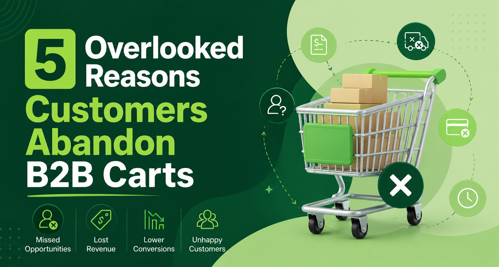 The Frictionless Checkout...
Learn how to reduce B2B cart abandonment by optimizing your PrestaShop checkout with flexible forms, file uploads,...
Jul 6, 2026 Read more
The Frictionless Checkout...
Learn how to reduce B2B cart abandonment by optimizing your PrestaShop checkout with flexible forms, file uploads,...
Jul 6, 2026 Read more -
 EU Directive 2023/2673...
Learn how to prepare your PrestaShop store for EU Directive 2023/2673 with a practical compliance checklist that...
Jul 3, 2026 Read more
EU Directive 2023/2673...
Learn how to prepare your PrestaShop store for EU Directive 2023/2673 with a practical compliance checklist that...
Jul 3, 2026 Read more -
 Ecommerce SEO for Google &...
Learn how online stores can improve visibility in Google, AI Overviews, ChatGPT, Gemini, and other AI search...
Jun 8, 2026 Read more
Ecommerce SEO for Google &...
Learn how online stores can improve visibility in Google, AI Overviews, ChatGPT, Gemini, and other AI search...
Jun 8, 2026 Read more

Mobile UX Best Practices for PrestaShop Stores

Mobile shopping is no longer growing; it has already taken over. Most online store traffic now comes from smartphones, and for many businesses, mobile sales represent the majority of total revenue. Despite this shift, many PrestaShop stores still struggle to deliver a seamless mobile experience.
Mobile UX (user experience) directly impacts conversion rates, bounce rates, and cart abandonment. If a store is slow, difficult to navigate, or frustrating to use, shoppers simply leave and buy elsewhere. Mobile users are impatient and expect fast, intuitive experiences that require minimal effort.
In this guide, we’ll explore the most important mobile UX best practices to help your PrestaShop store convert more visitors into customers.
What Is Mobile UX in E-Commerce
Prestashop mobile UX is as important as having a mobile app for your Prestashop store. It encompasses everything from page speed and navigation to checkout and visual design.
It is also critical to understand the distinction between mobile UI and mobile UX.
- UI (User Interface): The appearance of your store.
- UX (User Experience): What it’s like to use your store.
A store can look stunning but underperform when the experience of being in it is slow, confusing, or frustrating. Thus, both mobile user experience and user interface matter.
Why Do You Need To Care about the Mobile UX of Your PrestaShop Stores
Mobile UX directly affects revenue. A better experience leads to:
- Higher conversion rates.
- Lower bounce rates.
- Increased repeat purchases.
- Longer session times.
Common mobile UX mistakes include:
- Slow checkout processes.
- Complicated menus.
- Tiny tappable buttons.
- Long forms and unnecessary steps.
These problems can be addressed and often result in a surprising performance lift without increasing marketing spend.
Navigation For Mobile Best Practices in PrestaShop
Use a Clean, Collapsible Mega Menu. Just because you have 50 products does not mean they should all be displayed as giant nav buttons on your homepage. Since mobile screens are small, the browsing experience must be as easy as possible.
Go with Hamburger Menu
The hamburger menu is great for mobile. It keeps the screen clean and allows users to easily get to categories.
Best Practices Include:
- Limit menu layers to minimize confusion.
- Use icons to support categories.
- Highlight best-selling categories.
Improved navigation enables shoppers to find what they want much more quickly and with less frustration.
Improve Search Experience
Lots of mobile shoppers prefer to search rather than browse.
You can improve search with:
- Auto-suggestions and predictive search.
- Spelling correction and typo tolerance.
- Refinement options for price, brand, size and more.
Most of the time, you get better search features in the app built with the App Using PrestaMobApp Builder Module.
Keep Navigation Thumb-Friendly
Users are using their thumbs, not a mouse.
Ensure buttons are:
- Large enough to tap easily.
- Spaced well apart to prevent clicking on the wrong inputs.
- Placed within easy thumb reach.
- A thumb-friendly design means less friction and a more tactile feel.
If a user accidentally quits the app, they should be able to resume from the same screen via a minimizer in push notifications, which can also be part of Prestashop's push notification strategies.
Product Page UX Improvement on Mobile
Photographs are paramount in mobile shopping decisions. Hence, ensure they are appropriate and in the correct format.
Best Practices:
- Provide Zoom functionality.
- Use swipe galleries.
- Implement lazy loading for speed.
- Products need to be front and center for customers to see before buying.
Clear and Scanable Product Information
Mobile users skim content quickly.
So ensure to use:
- Bullet points for key features.
- Collapsible tabs for details.
- Trust badges and shipping info.
You can’t hesitate when you have clear information and confidence.
Add Sticky “Add To Cart” Button
A sticky Add-to-Cart button is displayed while browsing products.
It makes the product easily purchasable at any time and increases conversions significantly on mobile devices.
Mobile Checkout Optimization
- Reduce Steps in PrestaShop Checkout.
- The checkout should be quick and straightforward.
- Leverage one-page check-out modules and eliminate any non-essential form fields. Auto-fill and address suggestions save time and prevent errors.
Option To Enable Guest Checkout + Quick Login
Your app must not require a detailed sign-up for checkout.
You Can Offer:
- Guest checkout.
- Google login.
- Apple login.
- Facebook login.
Offer Multiple Mobile Payment Options
Provide flexible payment methods, such as:
- Digital wallets.
- PayPal.
- Cash on Delivery.
- Buy Now, Pay Later.
The more ways a customer can pay, the better chance you have at making a sale.
Performance & Speed Optimization for Mobile (General)
Reduce Page Weight
Heavy pages bog down mobile stores.
Improve speed by:
- Compressing images.
- Minifying CSS and JavaScript
- Removing unused scripts
Use PrestaShop Caching Modules
It caches the well used data and therefore reduces loading time.
Consider:
- Server-level caching.
- CDN integration.
Optimize Core Web Vitals
Core Web Vitals are about user experience:
- LCP: How fast does the page load?
- FID: How fast users can interact.
- CLS: Visual stability while loading.
Optimizing these metrics means better UX and SEO.
Mobile Conversion UI / UX Design Patterns To Keep You Ahead In The Race.
Visual Hierarchy & Typography
Use:
- Large fonts.
- High contrast.
- Plenty of spacing.
Your website's type can be one of the most powerful tools for readability and usability.
Take Away
Mobile UX isn’t a nice-to-have anymore; it’s a must. From navigation and product pages through to checkout and performance, the more you understand how things work, the more it will boost conversions.
A better mobile journey results in happier customers, greater engagement, and higher sales.