


- Why Mobile Checkout Fields Matter More Than Ever
- What Are the True Costs of Every Extra Field?
- The 5 Unnecessary Fields You Should Remove from Your Mobile Checkout
- How to Remove Fields in PrestaShop (Step-by-Step)
- What Should You Replace Them With? Smart Alternatives
- When Keeping a Field Is Actually Necessary (e.g., Phone Number)
- How to Measure the Impact of Removing Fields on Your Conversion Rate
- Who This Guide Is For
- What You'll Learn
- Why Mobile Checkout Fields Matter More Than Desktop Fields
- Field 1: The Company Field (B2C Stores)
- Field 2: The Phone Number (When It's Optional)
Why Mobile Checkout Fields Matter More Than Ever
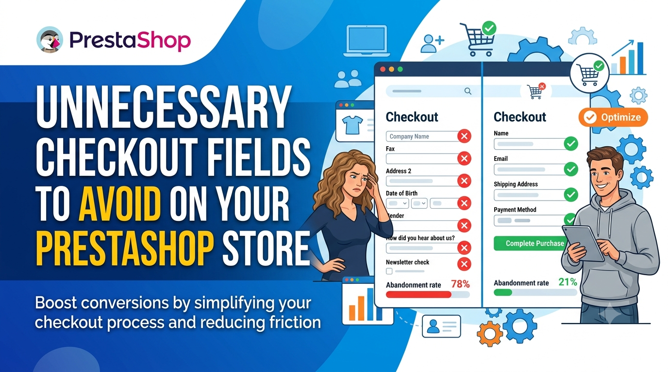
The five most unnecessary fields on mobile checkout are the 'Title' (Mr/Mrs), 'Company' (unless B2B), 'Phone' (when not required for delivery), 'Address Line 2' (can be merged with address line 1), and 'Fax' (obsolete). Removing these fields reduces cognitive load, speeds up the checkout process, and can improve conversion rates on mobile devices. For PrestaShop, you can hide or remove these fields via the Back Office or a module.
Here is the uncomfortable truth: every extra field on your checkout is a leak in your revenue pipe. The average checkout flow in 2024 is 5.1 steps long and contains 11.3 form fields, and 17% of users have abandoned a purchase because of the checkout process itself. When you multiply that across your monthly traffic, you are not losing a few sales. You are haemorrhaging a meaningful share of your revenue to a handful of form inputs that most customers do not want to fill in anyway.
Mobile makes this problem significantly worse. Mobile devices have the highest average cart abandonment rate, at 80.2%. Customers on their phones are often mid-commute, on a lunch break, or half-watching television. Every additional second spent typing takes them closer to closing the tab and moving on to a competitor. The optimal checkout contains only 7-8 fields, and completion rates drop 4-6% for every field you add beyond that.
The gap between the average (11.3 fields) and the optimal (7-8 fields) is precisely where your revenue is disappearing. You do not need a complete site redesign to close it. You need to make a series of surgical cuts to the fields that serve almost nobody.
This guide walks you through the five fields worth cutting first, why each one hurts your conversion rate, and exactly how to remove them in PrestaShop. You will leave with a shorter checkout, a faster path to payment, and a measurable improvement in mobile conversion.
What Are the True Costs of Every Extra Field?
Every field you keep in your mobile checkout is a line item on your profit and loss statement. The average checkout flow in 2024 runs 5.1 steps long and contains 11.3 form fields, and 17% of users have already abandoned a purchase because of the friction this creates. That is not a minor annoyance. That is revenue walking away while your customer sits three taps from completing the order.
The gap between what most stores ask for and what they actually need is stark. The average eCommerce checkout contains 11.3 form elements by default, while the optimal number sits at 7-8 fields. Completion rates drop 4-6% for every field you add beyond that range. On a store doing 500 mobile checkouts per week, a 5% drop means 25 lost orders weekly. Multiply that by your average order value and the annual figure becomes painful to calculate.
Mobile makes the problem worse. Mobile devices have the highest average cart abandonment rate at 80.2%, and broader research puts mobile abandonment even higher at 85.65%. The smaller the screen, the more punishing each additional field becomes. Typing a postcode or a company name on a phone takes seconds you are asking for without justification.
Here is what each unnecessary field actually costs you:
- Time. Every extra field adds typing, scrolling and mental load. On a smartphone keyboard, that is 10-30 seconds of additional friction per field, multiplied across every checkout.
- Abandonment. Research shows that 21% of shoppers abandon due to complicated or lengthy checkout experiences. Fields that serve your back office rather than the customer are a direct contributor.
- Decision fatigue. Each question forces a micro-decision. "Do I have this to hand?" "Why do they need this?" Every hesitation is a chance for the customer to reconsider the purchase.
- Support load. Confusing fields generate validation errors, and validation errors generate support tickets. Each ticket costs you time and money.
Baymard Institute puts the average cart abandonment rate at 69.57%, and desktop abandonment at 73.07%. Mobile consistently underperforms desktop on every measure. The conclusion is simple: each field you remove is a direct, measurable improvement to your conversion rate.
The 5 Unnecessary Fields You Should Remove from Your Mobile Checkout
Every field you keep is a toll booth on the road to payment. Baymard Institute's research shows completion rates drop 4-6% for every additional field you add, and the average checkout already carries 11.3 of them. On mobile, where abandonment rates hit 85.65%, each unnecessary input is pure revenue leakage. Here are the five fields to cut now.
1. Title (Mr, Mrs, Ms, Dr)
This field asks customers to broadcast a social title they may not care about, and it forces a decision before they can proceed. On a small screen, the dropdown is fiddly, and the options feel outdated. Gender-neutral shoppers find it alienating, and B2B buyers often select "Dr" or "Prof" simply to skip past it.
Keep it only if you sell formal menswear or run a subscription box where honorifics genuinely matter for the product. For everyone else, remove it. PrestaShop's default customer form includes this field, but you can disable it in Back Office under Customer Settings.
2. Company
Unless you operate a B2B store with invoicing and VAT handling, this field does nothing but add friction. Most B2C shoppers leave it blank, and the empty input still counts as a completed interaction that requires thumb movement and attention. On mobile, that wasted cognitive load compounds across the entire form.
Keep it only if you need it for tax-exempt purchases or trade pricing. If you do keep it, make it optional and hide it until a customer checks a "Business buyer" toggle. PrestaShop supports conditional display through its customer form configuration, so you can defer this question until it is actually relevant.
3. Phone Number
Phone fields invite hesitation. Customers worry about marketing calls, and many simply do not want to share their number with an online store they may never visit again. On mobile, the field also triggers a different keyboard layout, slowing down anyone who has to switch back to letters afterwards.
You need a phone number only for delivery exceptions or order verification. Courier services rarely call the buyer directly; they call the sender. Remove the field entirely, or make it optional and clearly state it will only be used for delivery updates. In PrestaShop, you can mark the phone field as optional in your carrier settings rather than the general customer form.
4. Address Line 2
This is the most common redundant field in ecommerce. Data from Baymard shows that format, not the number of fields, causes the biggest usability issues; Address Line 2 is the classic offender. Most customers do not use it, and those who need it (flat numbers, building names) quickly learn to squeeze that information into the main address line.
Remove it and let customers write their complete address in one field. Autocomplete services handle the rest. In PrestaShop, you can hide Address Line 2 in the Address format settings without touching any code.
5. Fax Number
Fax is a leftover from the 1990s. No consumer owns a fax machine, and almost no business relies on one for order confirmation. This field exists in PrestaShop's default address format because the platform has carried it forward across versions. It adds nothing to your checkout and signals that your store has not been updated in years.
Delete it without hesitation. If you are working with a custom theme that still asks for it, remove the field from your theme's address template or use a PrestaShop custom checkout fields module to control exactly which fields appear.
| Field | Why It Hurts Mobile Conversion | When You Can Keep It |
|---|---|---|
| Title | Forces a social decision; alienates some shoppers | Formal apparel or subscription products where honorifics matter |
| Company | Irrelevant for B2C; adds field without benefit | B2B stores with invoicing or trade pricing |
| Phone Number | Privacy concerns; keyboard switching on mobile | Delivery exceptions or courier requirements; make it optional |
| Address Line 2 | Unused by most; complicates the address format | Rarely. Let customers write the full address in one line |
| Fax Number | Obsolete technology; signals an outdated store | Never. Remove it permanently |
The pattern is simple: if a field would stop you from buying on your own phone, cut it. Every field you remove brings you closer to the optimal 7-8 fields Baymard recommends.
How to Remove Fields in PrestaShop (Step-by-Step)
Removing unnecessary mobile checkout fields in PrestaShop is quicker than most merchants expect. You have two paths: native configuration for simple fields, and a FME's custom checkout module for granular control over every input on your checkout page. Here is how to execute both approaches without touching core files or breaking your theme.
Step 1: Audit Your Current Checkout Fields
Before deleting anything, map out exactly which fields appear on your mobile checkout. Load your store in a mobile viewport, add a product to the cart, and screenshot each step. Compare what you see against the list of unnecessary fields covered earlier in this guide. Mark which fields are redundant for your product type and customer base.
In recent PrestaShop builds, the default checkout page is managed through the theme's checkout template files. The native settings give you limited control, so expect to rely on a module for anything beyond toggling a handful of options.
Step 2: Remove Fields Using Native PrestaShop Settings
PrestaShop ships with a few built-in options to streamline checkout fields. Navigate to Shop Parameters > Customer Settings in the back office. Here you can:
- Disable the company field for B2C stores by turning off the "Enable Company" option in the address form.
- Toggle the "VAT number" field off if you do not sell to businesses within the EU.
- Turn off the "Other" or additional information text area that appears as an open text box in the delivery address form.
These toggles remove the most common offenders instantly. They do not, however, give you the ability to hide fields conditionally, reorder inputs, or remove fields on one device type while keeping them on desktop. That level of granularity requires a dedicated module.
Step 3: Use a Module for Advanced Field Removal
For full control, install a checkout fields module such as the custom checkout module from FME Modules. This module lets you hide default fields, add custom ones, set conditional logic, and apply changes per customer group or device type. Once installed, go to the module's configuration page and:
- Select the form you want to edit: billing address, shipping address, or the delivery step.
- Locate the field you want to remove from the list of active inputs.
- Disable it or make it invisible on mobile devices only.
- Save and test the checkout on a mobile device or responsive browser window.
This approach avoids editing template files directly, which means your changes survive theme updates and core upgrades without breaking.
Step 4: Combine with One-Page Checkout
Removing fields is only half the battle. If your checkout still spans multiple steps with a progress bar, consider consolidating it. The One Page Checkout PrestaShop module collapses billing, shipping, and payment into a single view, which directly addresses the 5.1-step average flow that Baymard Institute identified as a key abandonment trigger. Fewer steps combined with fewer fields is the fastest measurable win for mobile conversion rates.
| Field | Native PrestaShop Option? | Module Required? |
|---|---|---|
| Company name | Yes, toggle in Customer Settings | No, for simple removal |
| VAT number | Yes, toggle in Customer Settings | No, for simple removal |
| Other / additional info | Yes, toggle in Customer Settings | No, for simple removal |
| Field reordering or conditional display | No | Yes, custom fields module |
| Device-specific visibility (hide on mobile only) | No | Yes, custom fields module |
Test every change after applying it. Remove one field at a time, place a test order on your phone, and monitor your abandonment metrics. A single unnecessary field can cost you a measurable share of completed purchases, so treat this as ongoing optimisation rather than a one-off cleanup.
What Should You Replace Them With? Smart Alternatives
Removing unnecessary mobile checkout fields only solves half the problem. If you strip your checkout down to the bare minimum but still force customers to type their full address, postcode, city, and county one keystroke at a time, you have traded one form of friction for another. The goal is not just fewer fields. It is fewer decisions, fewer taps, and fewer opportunities for your customer to change their mind.
The smartest mobile checkouts lean on technology to do the heavy lifting. Address autocomplete is the single highest-impact upgrade you can make. Tools like Google Places Autocomplete or Loqate let customers type their house number and street, then select their full address from a dropdown. That one interaction replaces five or six fields and eliminates typos that cause failed deliveries and support tickets. On a phone, where typing is slow and error-prone, this is not a nice-to-have. It is a conversion lever.
Smart defaults work the same way. If a customer has already entered their shipping address, prefill the billing address with a checkbox. If they checked out last week, remember their details for next time. Every field you can prefill is a field the customer does not have to think about. And every moment of thinking is a moment they might start questioning the total.
One-tap payment options take this further. Apple Pay, Google Pay, and PayPal express buttons bypass the form entirely. The customer authenticates with their fingerprint or face ID, and the transaction is done. No address fields, no card number, no CVV. Just a purchase. For mobile shoppers, who are often mid-commute or holding a phone in one hand, this is the difference between completing a sale and losing it.
If you are running PrestaShop, you can combine these approaches with a one-page checkout module that consolidates everything onto a single screen, then layer on the autocomplete and express payment buttons on top. The point is to build a checkout that respects the constraints of the device. Every field you remove is a conversion you keep, but every field you automate is a conversion you never risk losing.
When Keeping a Field Is Actually Necessary (e.g., Phone Number)
Removing mobile checkout fields is a revenue strategy, not a dogma. There are legitimate cases where a field you might consider trimming serves a real business purpose. The trick is to identify which fields carry genuine operational weight and which are simply there out of habit.
Let's be clear about the stakes. With the average checkout flow still holding at 5.1 steps and 11.3 form fields, and 17% of users abandoning due to checkout length every field you keep needs to justify its existence. But some fields earn their place.
Phone Number: The Most Common Edge Case
For most D2C stores, the phone number is a prime removal candidate. Customers hate typing it, and a missed digit means a failed delivery attempt. However, there are three scenarios where it becomes essential:
- High-value or large-item delivery. If your courier requires a call on arrival, a phone number is non-negotiable. Furniture, white goods, and oversized parcels fall into this category.
- Fragile or perishable goods. A phone call can save a delivery of flowers, cakes, or glassware from being left in the sun or with an unprepared recipient.
- Custom or made-to-order products. If you need to confirm measurements or materials before production, a call saves an email back-and-forth.
If you fall into these categories, keep the field but apply conditional logic. In PrestaShop, you can set the phone field as optional in the customer address form rather than required. You can even rename it to "Phone (optional, for delivery updates)" which dramatically increases completion rates while keeping the data available for those who choose to provide it.
Company and VAT Number: B2B Versus B2C
For B2C stores, the company field is pure friction. For B2B, it's the lifeblood of invoicing. If you sell to other businesses, don't remove the company field; instead, make it smart.
PrestaShop merchants can leverage custom checkout fields modules to trigger the company and VAT fields only when a specific customer group (such as a wholesale group) is checking out. B2C customers see a clean, two-field form, while B2B customers get the fields they need for their accounts department. The alternative is forcing everyone through a B2B-style checkout, which is a terrible experience for your retail customers.
Delivery Instructions or Notes
This field often gets flagged as unnecessary, but it's a genuine cost-saver. A single "leave with neighbour" note prevents a failed delivery, a return trip, and a refund request. The Baymard research on optimal checkout design supports the idea of reducing the form to 7-8 fields, but a notes field is one of the rare exceptions where the data has direct operational value.
Keep it, but make it conditional. Only show it after the customer confirms their shipping address. Placing it earlier in the process adds noise before the customer is mentally committed to the delivery location.
How to Make Fields Conditional in PrestaShop
The standard PrestaShop field configuration alone isn't enough for true conditional logic. You have two practical paths:
| Approach | What It Does | Complexity |
|---|---|---|
| Native PrestaShop settings | Makes fields optional or required globally for all customers. | Low. Accessible via Order Settings and Customer Settings in the back office. |
| Using a checkout module | Enables conditional visibility based on customer group, product type, or cart value. | Medium. Requires installing and configuring a module within the PrestaShop back office. |
For most merchants, starting with the native settings is the fastest win for mobile checkout fields. Set the phone to optional, and see if your failed delivery rate changes. If it does, you can keep it. If not, you just removed your last excuse.
How to Measure the Impact of Removing Fields on Your Conversion Rate
Removing unnecessary mobile checkout fields is only the first step. You need to prove that the changes actually moved the needle; otherwise, you are guessing. The good news is that measuring the impact is straightforward if you set up the right tracking before you make any changes.
You have three solid layers of measurement available: PrestaShop's built-in statistics, a proper analytics platform, and a structured A/B test. Each serves a different purpose, and together they give you a complete picture of how your checkout changes affect revenue.
Start with PrestaShop's Built-in Stats
PrestaShop ships with a native statistics dashboard that tracks orders, visitors, and conversion rates. It is not the most granular tool, but it gives you a baseline without any extra setup. Check the conversion rate for a full week before you remove any fields, then compare it against the same metric for a week after the change.
- Note the conversion rate for both mobile and desktop separately, since removing fields will likely affect mobile more.
- Track the average order value as well, not just conversion rate. A healthy checkout should not sacrifice order size for speed.
- Ignore holiday periods and flash sales when comparing, as these skew the numbers.
Set Up Google Analytics for Funnel Visibility
PrestaShop's stats tell you the outcome, but Google Analytics shows you where shoppers drop off. Create a funnel view that tracks each step of your checkout: cart page, address step, shipping step, payment step, and confirmation. With that funnel in place, you can see exactly which field deletions reduced abandonment at a specific step.
Look for a particular pattern: a high drop-off on the address step usually signals too many form fields, while a drop-off at payment points to trust or fee issues instead. When you remove fields and see the funnel ratio between steps improve, you have direct evidence the simplification worked.
Run a Proper A/B Test
A/B testing is the gold standard because it controls for external factors like traffic spikes or seasonality. Use a PrestaShop module that supports split testing, or a third-party tool that can serve different checkout variants. Show half your traffic the original checkout and half the streamlined version, then measure both conversion rate and revenue per visitor.
Run the test for at least two full weeks to account for weekly buying cycles. Cutting a test short because the results look promising is a classic mistake, and it often leads to decisions based on noise rather than signal.
| Measurement Tool | What It Tells You | Best Used For |
|---|---|---|
| PrestaShop built-in stats | Overall conversion rate and order volume | Quick baseline and post-change comparison |
| Google Analytics funnel | Drop-off rates at each checkout step | Identifying which step benefits from field removal |
| A/B test module | Causal impact of the change on conversions | Confident, data-backed decisions |
The only metric that truly matters is revenue per session, not conversion rate in isolation. A checkout that converts slightly less but produces higher average order value is still a win. Track both, and make decisions on the combined picture.
Check your abandonment rate trends across a few weeks rather than a single day. Mobile abandonment rates run above 80% on many stores, so a small percentage improvement can translate into significant revenue. Once you see a sustained lift of a few percentage points, you have your proof that every removed field was worth it.
Unnecessary mobile checkout fields are the easiest conversion leaks in ecommerce. Every extra field you ask a shopper to complete on their phone costs you sales, and the data proves it: the average checkout flow contains 11.3 form fields, while the optimal number is just 7-8, and completion rates drop 4-6% for every field you add. This guide shows you exactly which five fields to remove from your PrestaShop checkout, why each one hurts your mobile conversion rate, and how to cut them out without breaking your order process. You'll walk away with a leaner checkout that respects your customer's time and your bottom line.
Who This Guide Is For
If you run a PrestaShop store and you've watched cart abandonment numbers creep higher, this guide is for you. It's written for anyone who owns or optimises an online store checkout and suspects the form itself is the problem.
- PrestaShop store owners who want to reduce friction on mobile without redesigning their entire theme.
- Conversion rate optimisers looking for evidence-based fixes that show measurable results quickly.
- Digital agencies managing PrestaShop stores for clients who complain about abandoned carts.
- Ecommerce developers who need to know which fields are safe to remove and which PrestaShop modules handle it cleanly.
- Shop managers in B2B or B2C who are tired of explaining why checkout is "just a bit long."
What You'll Learn
This guide is practical, not theoretical. By the end, you'll know exactly what to change and how to do it inside PrestaShop.
- Why mobile checkout fields have an outsized impact on your conversion rate.
- The five specific fields that add friction without adding value.
- How PrestaShop's default checkout settings contribute to the problem.
- Which modules help you remove or manage fields without touching code.
- How to hide fields conditionally instead of deleting them permanently.
- What the optimal mobile checkout field count actually looks like.
- Common mistakes merchants make when trimming their checkout forms.
- A practical checklist you can apply to your store today.
Why Mobile Checkout Fields Matter More Than Desktop Fields
Mobile shoppers are not just desktop shoppers on smaller screens. They're more impatient, more distracted, and far more likely to abandon a purchase. The data is stark: mobile devices have the highest average cart abandonment rate, at 80.2% according to ContentSquare. Baymard Institute's research puts mobile abandonment even higher at 85.65% for mobile versus 73.07% on desktop.
When you force a phone user to type their full company name, a fax number, or a secondary address line, you're asking them to do physical work that feels disproportionately annoying on a touchscreen. Each field requires tapping, scrolling, and switching between keyboard layouts. That's why 21% of shoppers abandon carts due to complicated or lengthy checkout experiences, according to Dynamic Yield's data. On mobile, that percentage feels even heavier because every extra field doubles as a reason to leave.
Your competitors are already removing unnecessary fields. The stores that win on mobile are the ones that treat every form field as a cost, which is precisely what Baymard's research confirms: the average checkout flow in 2024 is 5.1 steps long and contains 11.3 form fields, and 17% of users have abandoned because of it. When you remove just a few fields, you're not making a cosmetic change; you're removing the specific friction points that cost you revenue on every single order.